Hi! My name is Robert.
I’m an independent consultant specializing in business intelligence and brand building. But mostly,
I make things better.
How? I help companies find practical solutions through deep dive analysis, tool development and fine design.
scroll
What I Do
I work with forward-thinking clients to build stronger companies. I combine connective thinking with refined design skills to achieve objectives ranging from small business scaling to wide-spread operational improvements.My work is impactful because it provides informative insights in appealing packages whether I’m developing analytic tools or making marketing materials. And with experience in industries ranging from oil and gas to luxury fashion, I’m comfortable adapting quickly to new domains and diverse teams.
Informed improvements.
Problem-solving isn’t just about thinking outside the box. It’s about having multiple toolboxes to work with.I blend data-driven research with qualitative investigations to discover original insights. My interdisciplinary background helps me to ask productive questions and deliver well-presented answers. The result is solutions that stakeholders trust.
Create effective change.
Insights need to do more than make sense. I take a process-oriented approach to implementation that ensures insights lead to real improvements.I collaborate closely with teams to understand their needs and their workflow. As a result, I can help my clients to repeatably and accurately target their objectives by developing accessible, interactive tools.
Communicative design.
I go beyond spreadsheets to help my clients present their story convincingly. Together, we develop strong narratives that are backed by polished visuals.My websites, decks and advertisements have helped clients share compelling messages to consumers and investors. I’m happy to help you find the best version of your concept and bring it to a wider audience.
Let's work together.
If these sound like solutions to problems that you're facing—or if you're not sure what your next move might be—we should talk.
scroll
Selected Work
scroll
Contact
If you're working on an interesting project, stuck on a challenge or just looking to add someone awesome to your team, let's talk.
About Me
I don’t fit perfectly into a job description. I’m motivated by the curiosity that comes from diving into unsolved problems to find creative answers. All of my work is about making the best solution possible but my areas of focus include strategy, research, brand building, marketing, tool development and visual design.
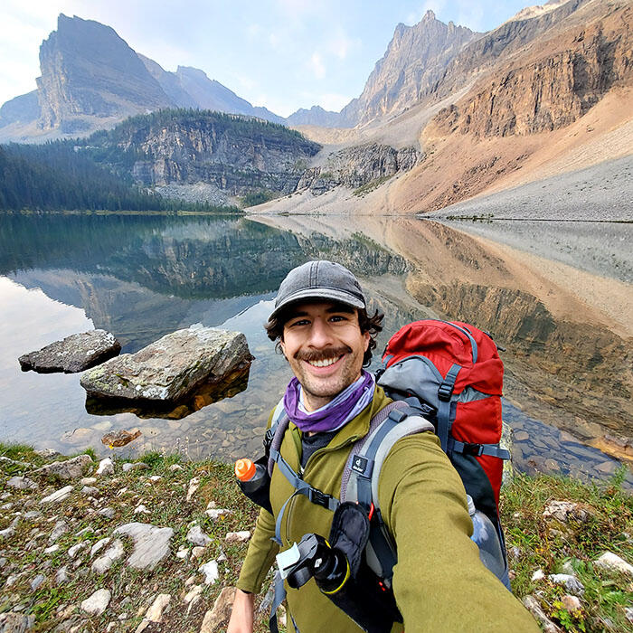
A bit of background.
I apply an interdisciplinary approach to offer independent consulting services where strategy work is intertwined with implementation. I've worked directly with ambitious founders, engineering teams, and partners of all sorts. I help them to discover the best version of their ideas and to deliver solutions with substance and style.
To see my work, visit my portfolio.
I began my work with design and marketing roles before expanding to include data-oriented work. It was a bit of an unconventional route to get there. After a bachelors in Politics and Spanish, I completed a Masters in Social and Political Thought—the kind of program that trains you to pull ideas apart and figure out what keeps them alive.My research dealt with cryptography: I wanted to know how technologies of secrecy changed political relationships. Across its discourses, mathematics, music (yes, really) and blockchains, I found an apparatus that dealt with enemies. You can read that work here.
*Please don't ask me to work on your crypto thing. I'm not interested.
Since then, I've made my career on asking quality questions, listening closely and learning quickly. I'm fascinated by how the pieces fit together and whether we can make a different picture from that puzzle.
Outside of work.
When I'm not working you can find me—or hopefully not—outdoors near my home in Calgary, Alberta. I'm often exploring the eastern Canadian Rockies and their foothills where I backpack, run, bike, and ski. If I'm not out there, then I'm likely inside tinkering with a project like my photography or a fantasy cycling game.
My Role
RAMS: Taking the Problem Head On
After a catastrophic accident, PTT, the national energy company in Thailand, sought to improve its pipeline integrity process. I joined a team of engineers with the goal of identifying shortcomings in how the company analyzed risk and improve the way it prioritized mitigation activities.My contribution was to develop a software tool called the Risk Assessment Model Suite (RAMS). This Excel-based package would both be used to evaluate the natural gas pipeline network, diagnose issues with the underlying data, and communicate with corporate leadership.The result: a sustainable foundation for safer operations across many levels of the company.
Data Strategy
Risk Reduction Requires Reliability
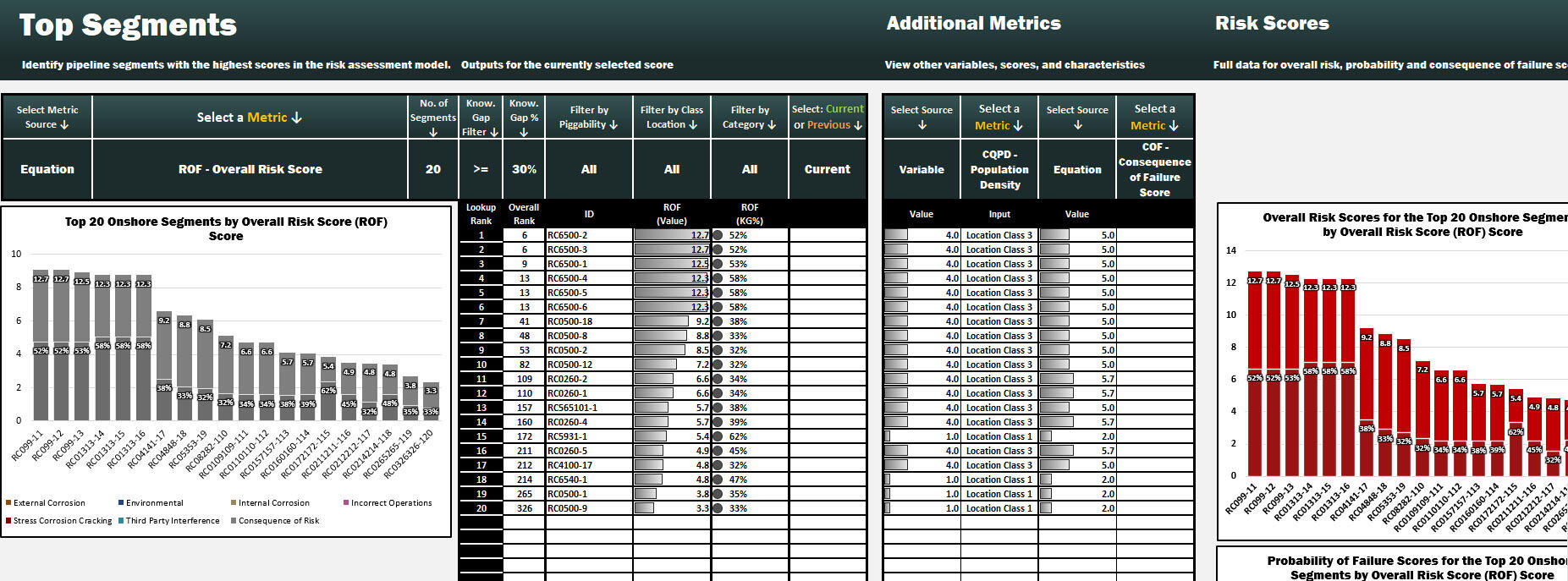
It was immediately apparent that unreliable data hindered PTT’s ability to competently and reliably target high-risk sectors across hundreds of pipeline routes. To reduce the probability of future incidents, data would need to be assessed for errors and their sources. I achieved this by creating a new KPI called the ‘Knowledge Gap’ which measured the proportion of risk attributable to a lack of information.This metric became a corner-stone reference for the engagement. By isolating data quality as an issue, it revealed where additional inspections were needed to reduce risk. Ultimately, it allowed our team reduce data errors by over 70% . Moreover, the KPI highlighted areas staff required additional training helping to prevent past errors for recurring.These advances in data quality thus led to both technical and human improvements.
Tool Building
Interactivity Leads to Effective Analysis
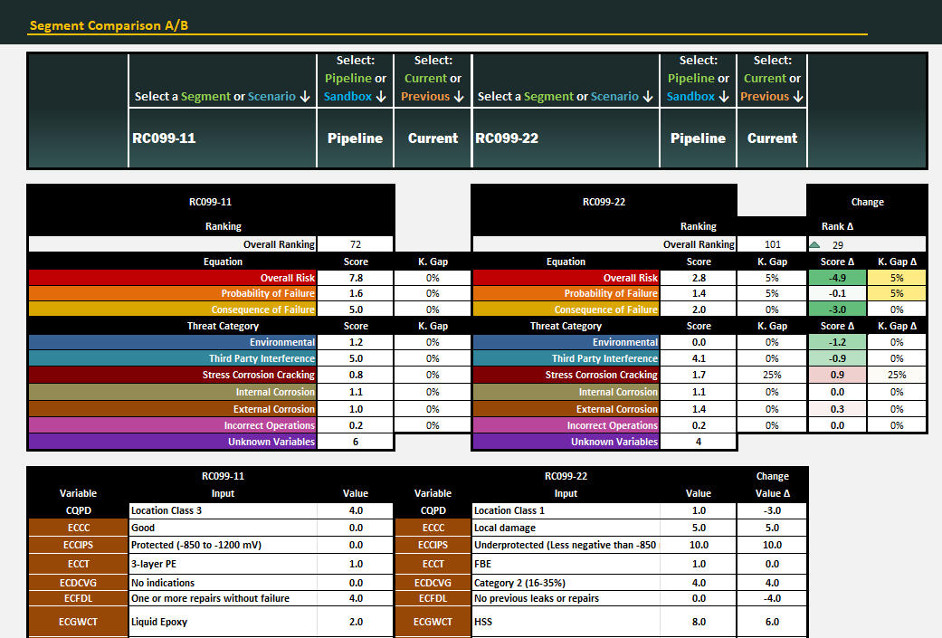
Pipeline maintenance requires data to be readily available and easily assessed. To facilitate this, I designed the RAMS analytic tools so that engineers could progressively drilldown on their system. Advanced filterability simplified the process of finding high-risk segments and integrated lookups allowed them to identify key risk factors.A new feature called the Sandbox enabled engineers to model different scenarios and therefore project how remediation would improve safety or further deterioration might increase risk. Likewise, the team could compare maintenance options and relative impacts. This interactivity meant that critical planning activities to be conducted at the moment of analysis.All in all, the RAMS streamlined the mitigation workflow making it easier to know where to look and determine what to do.

Business Intelligence
Ongoing Organizational Improvements

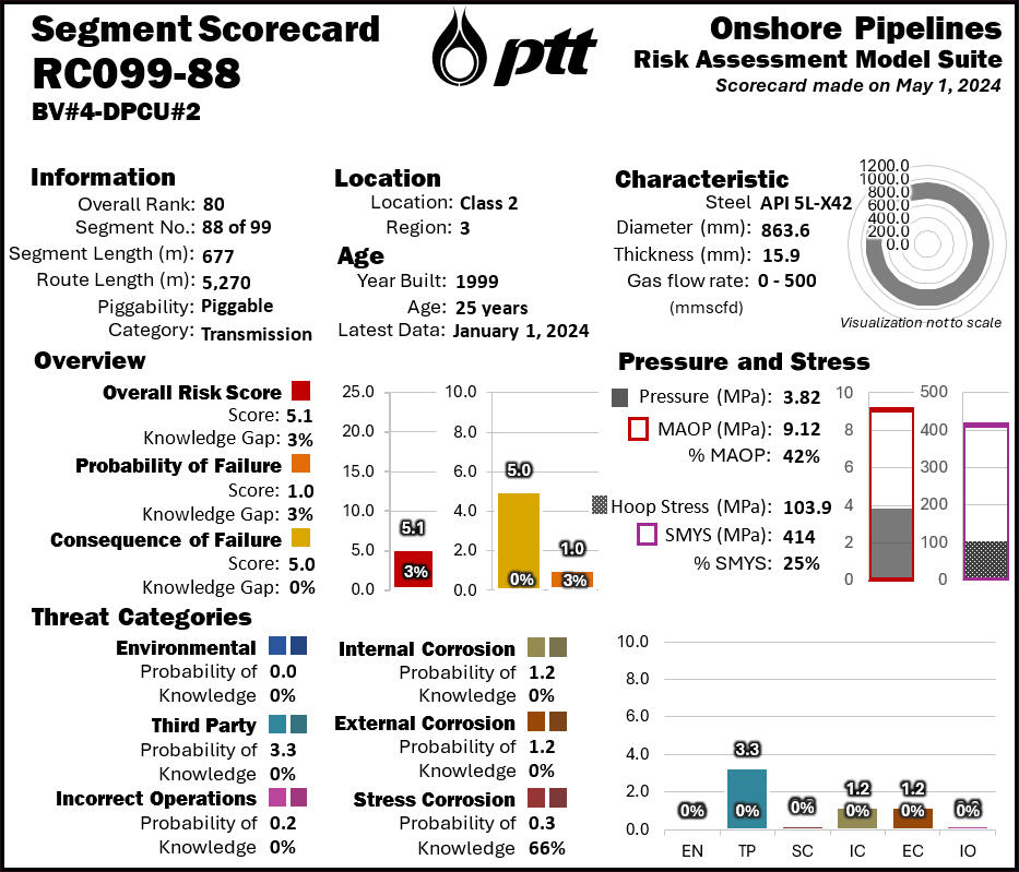
With a strong foundation in place, we turned our focus to ensuring usability and efficacy. A key element of this were the highly readable dashboards and scorecards created in the RAMS. These visualizations and re-designed reports clearly showed executives what needed to happen and why. Lower friction communication meant easier approvals and more completed maintenance work.To support continual risk reduction, I built a suite of supporting tools to replace the previous ad hoc process. New data-entry procedures validated inputs to uphold data integrity and introduce greater accountability. New features for before and after comparisons made it possible to track maintenance activities and understand trends.Building these tools with an eye to the future created a legacy beyond the projects original scope.


Artphere US
My Role
Revitalizing a Luxury Bag Brand
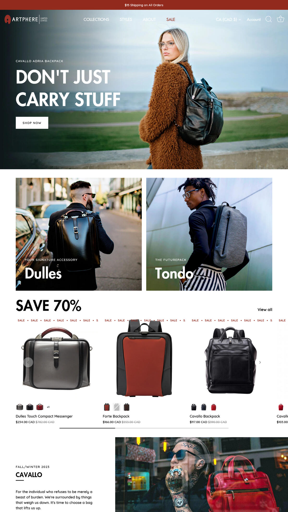
Artphere is a line of luxury bags by the Japanese manufacturer Yuri, an OEM for Louis Vuitton. While the company had an established presence in Japan, their branding struggled to connect with Western markets. In close collaboration with their American distributor, I had the pleasure of repositioning their brand by working on everything from campaign development, art direction, copywriting, and final implementation on their webstore.

Brand Identity
Imagining an Icon
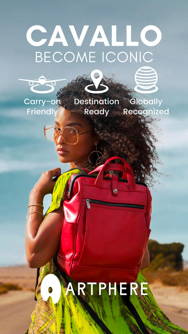
To start, we reconceptualized how Artphere’s unique designs were marketed by framing their bags as a signature accessory. For bold stylists, these were the final piece to complete a look; for more conservatives dressers, they were a standout element that added a touch of flash. The new brand went beyond being an everyday briefcase. When you carried an Artphere bag, you were becoming an icon.
E-Commerce
Making a Bag Worth Buying
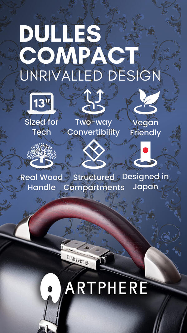
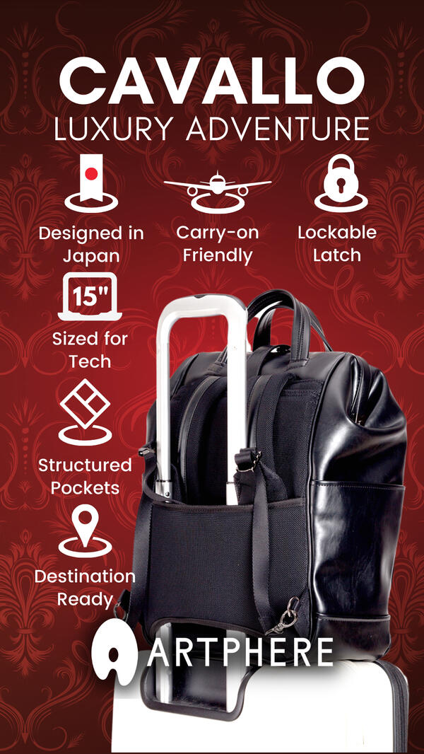
With limited previous exposure, it was critical to build the bags’ value to justify their price. In Japan, Artphere relied on department store demonstrations to create value. In the US, that was not an option. Buyers would have to be convinced of their quality—even if they had never seen an Artphere bag in person.To do so, I took a feature-oriented approach on the artphere.us webstore and online advertising. Compelling lifestyle images were paired with easy-to-read icons that highlighted selling points and underscored the products high-end origins. This new e-commerce experience let customers meet the product and immediately fall in love.

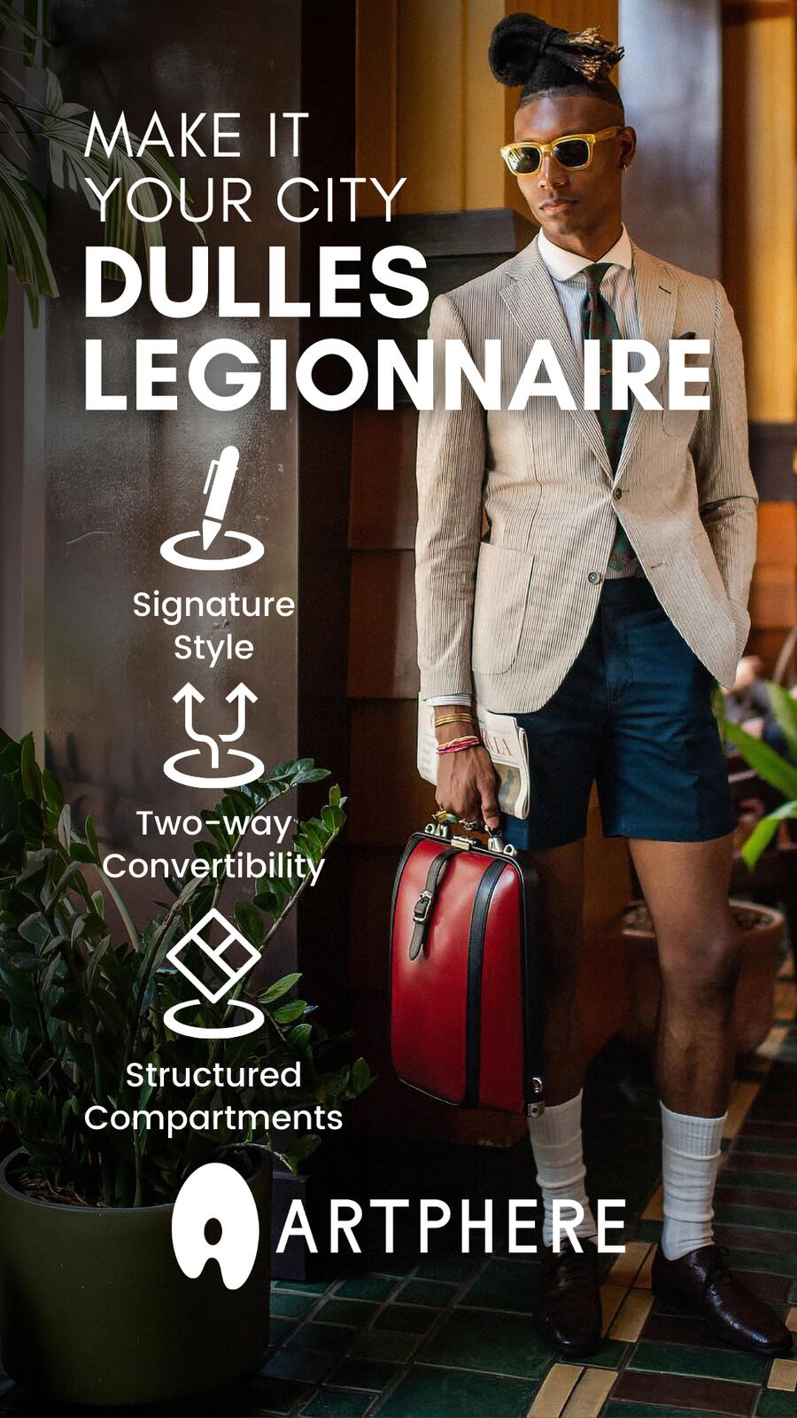


Credits: Nathan Rocky, Quentin Thrash

Sunurban Developments
My Role
Building a Home Improvement Business
When I first met the Sunurban Developments team they were looking to expand their operations to service more clients. To help them scale effectively, I reworked both the online presence and key business processes. We tackled two key issues: how to generate more leads and convert those into profitable projects.
Web Design
A Solid Foundation Matters
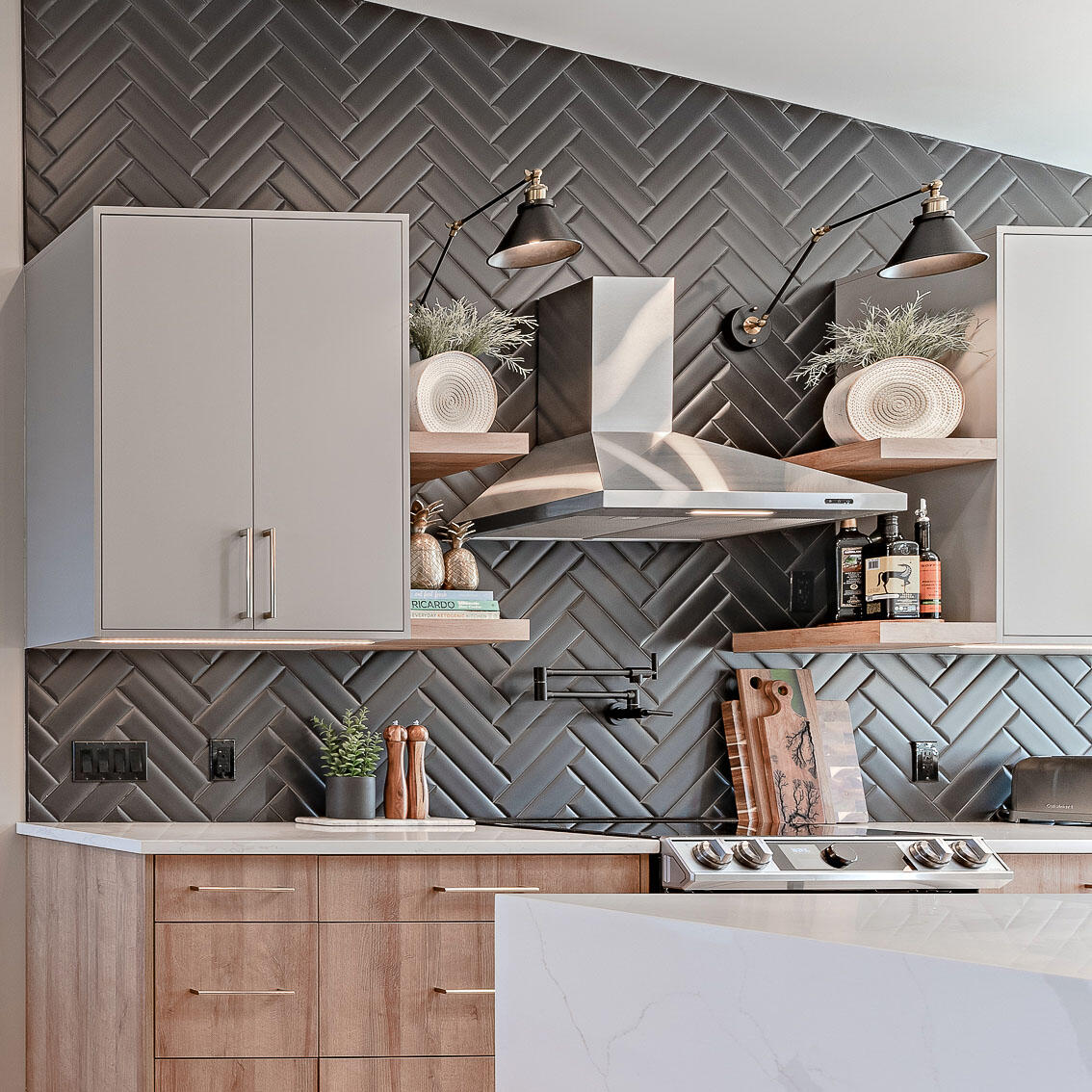
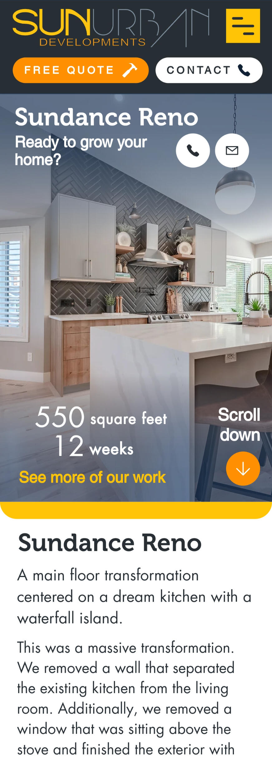
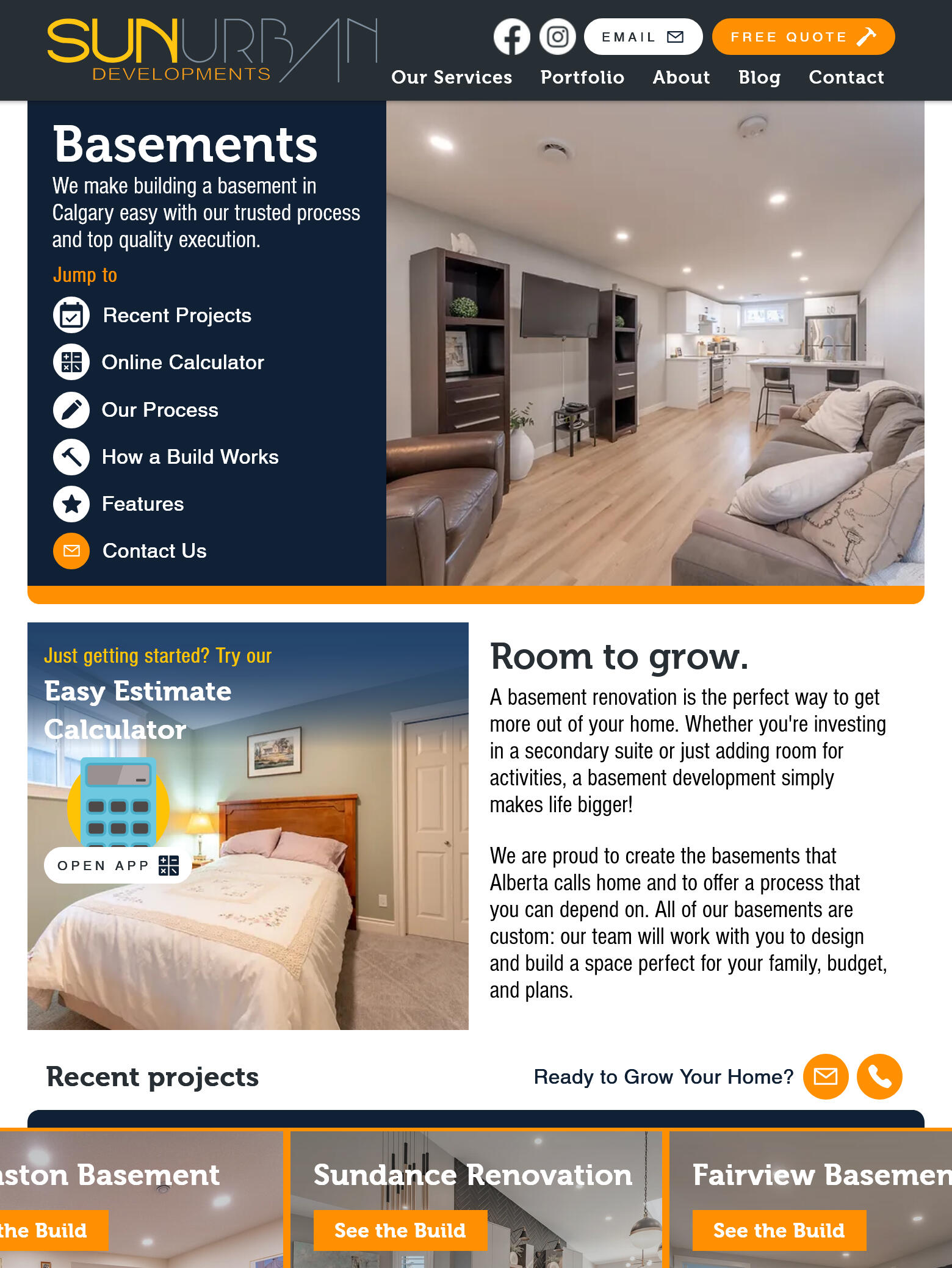
Alongside the house itself, renovations are the most expensive purchase most homeowners will make. Credibility is of the utmost importance—especially for a young company. The goal of re-designing the Sunurban website was therefore to present an immediately identifiable image while demonstrating quality workmanship.Pairing a bold colour scheme with clear navigation made a recognizable presence that quickly directed visitors to key information. Consistent icon usage made value propositions obvious by highlighting key features, especially in their portfolio. We built expertise and trust through clear step-by-step explanations that guided consumers further into the Sunurban sales funnel. An online calculator proved to be an important source of leads and great differentiator compared to their competition.
Process Improvement
Digital Tools for a General Contractor
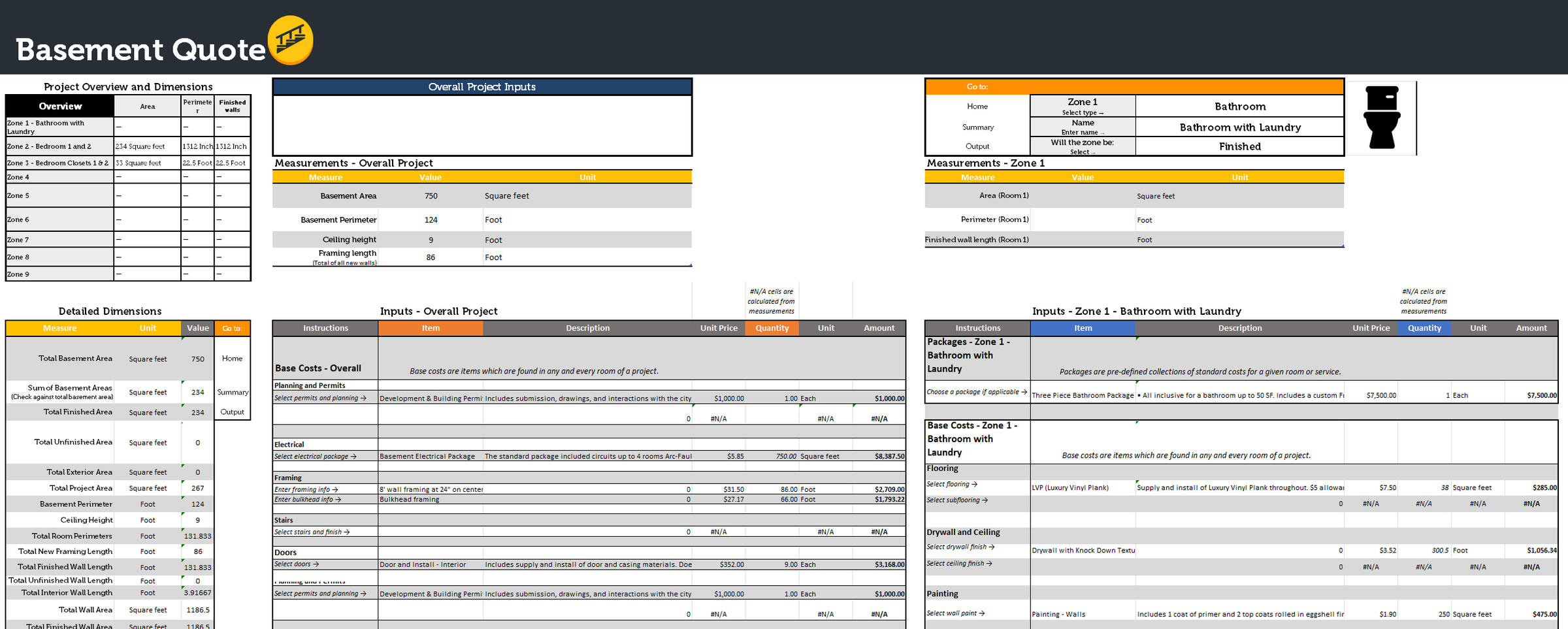
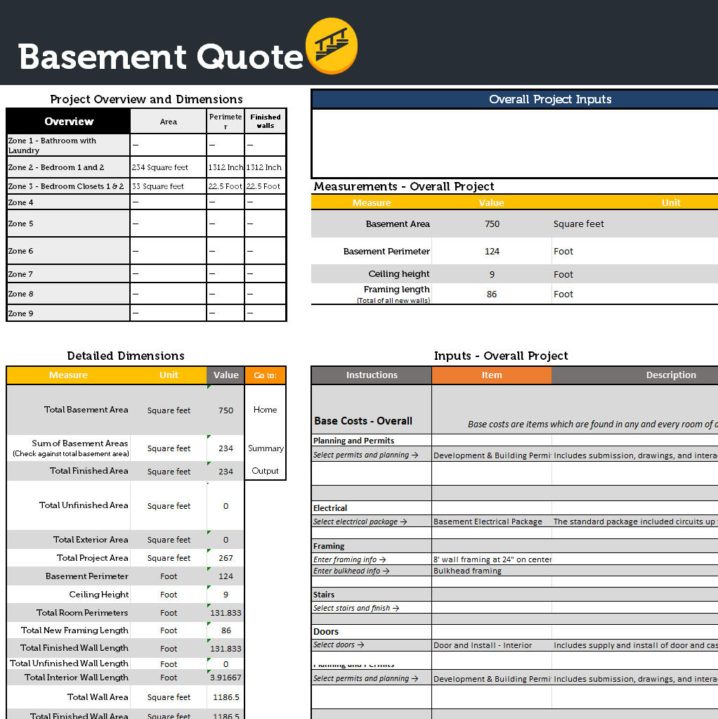
All small business work within narrow margins. Accurate cost projections are therefore extremely important to their profitability. I developed new tools for quoting and managing projects that made the process easier and more precise.A central component of this was a tool that made translating floor plans into estimates quicker. Built around a central database of costs, the tool allowed the team to price their work consistently as well as to custom packages. A room-by-room approach ensured that each item in a project was accounted for correctly. Branded outputs were available in multiple breakdowns so that clients were given the clearest possible presentation of the work.The process helped Sunurban to deliver more quotes with greater accuracy leading to more conversions in less time.

Public Place Network
My Role
Building a Startup’s Identity
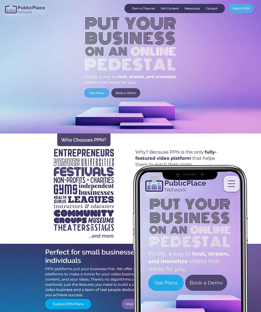
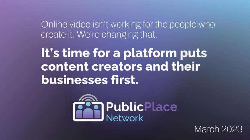
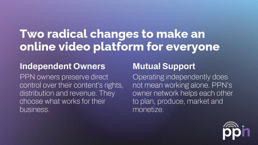
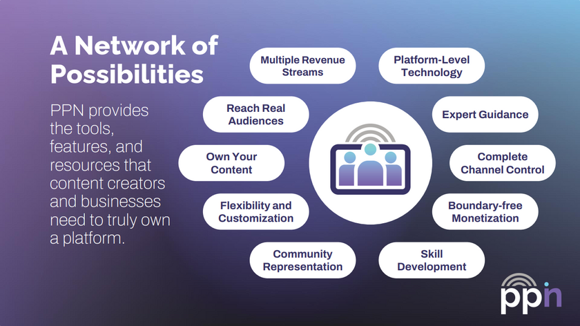
PPN is a streaming platform centered community-first videos and the people who make them. I worked closely with leadership to create messaging and content that introduced their technology to creators and users as a new way of distributing video. Together, we codified a brand ethos that emphasized support and individuality.As a company in the early stages of product development, they sought a style that was easily identifiable and but remained flexible for future changes. Visually, I built on their existing logo and colour scheme to define a design language that could accommodate a huge range of styles while retaining a unified image. This look was rolled out on their new website, across social media, and in pitch decks.
Graphic Design
A Cohesive Style for Diverse Creators
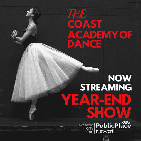
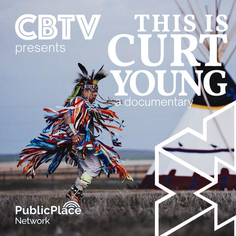
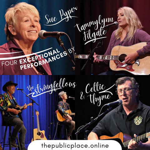
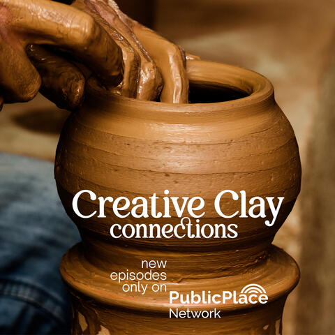
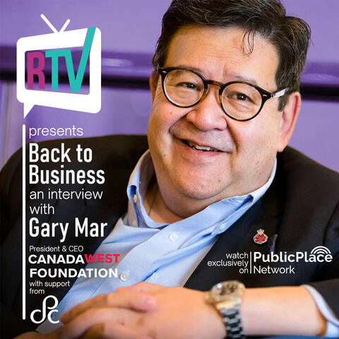
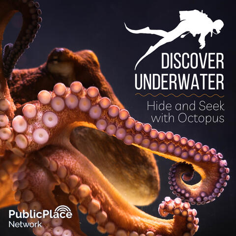
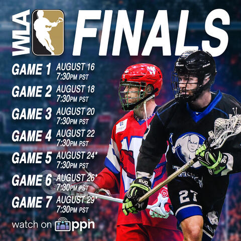
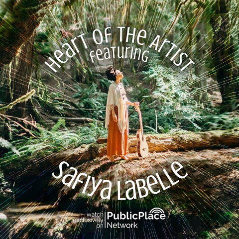
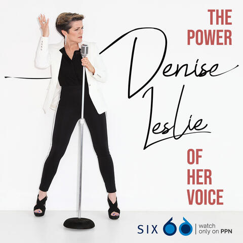
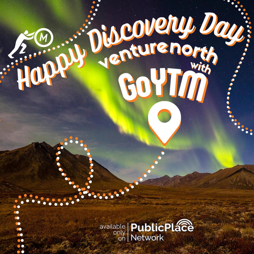
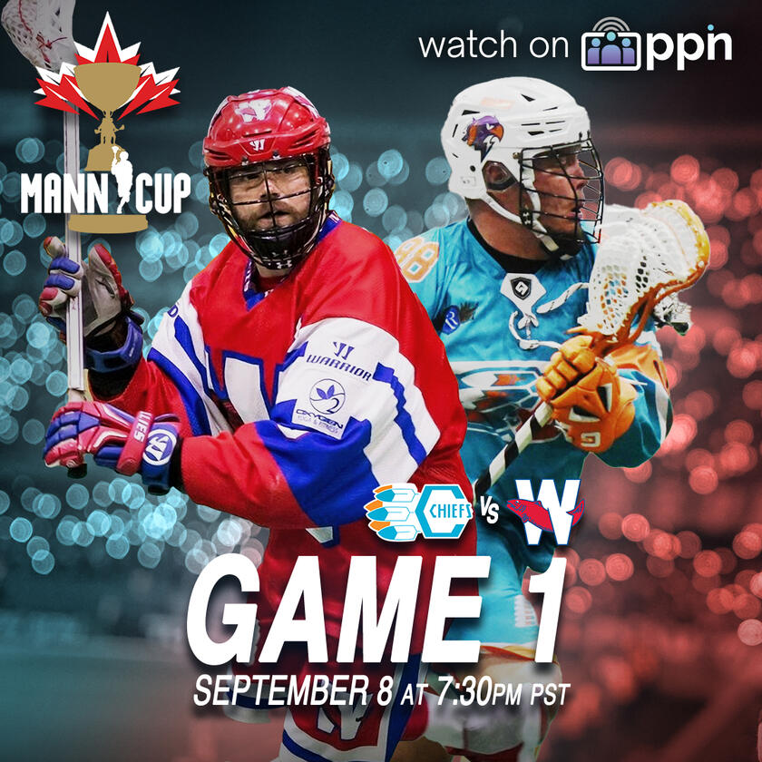
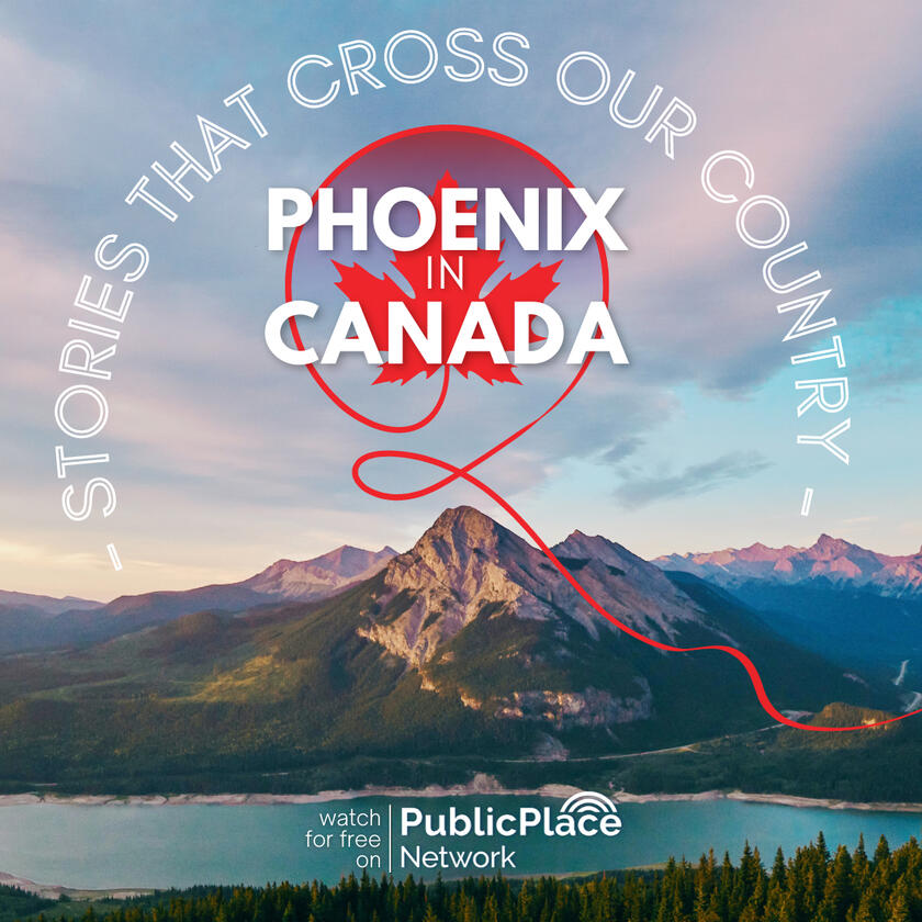
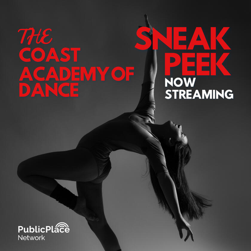
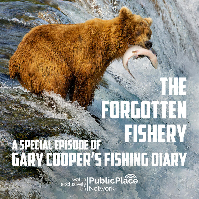
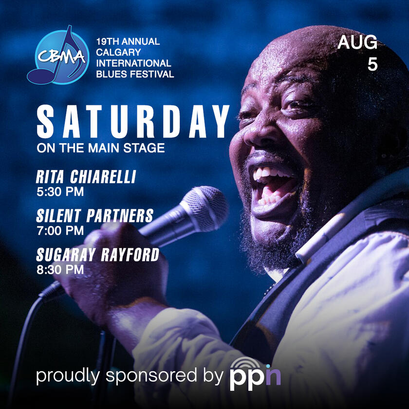
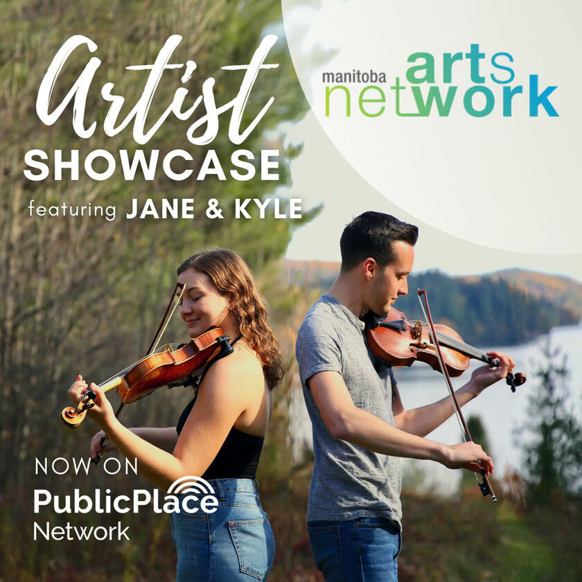
One of the primary challenges for PPN was maintaining a coherent, polished look for content that came from producers a wildly different backgrounds. With varying levels of experience and limited access to assets, I leaned into strong textual designs with structured brand placements to offer create consistency and recognizability.

















Story Telling & Community Building
Everyone Wants to Say ‘Disrupt’
With an early-stage product and rapidly changing goals, it was important to articulate a clear and compelling message. It’s not enough to say you’re different: you need to show how and why that matters.I began with a deep-dive profile of PPN users to understand how best to direct its offerings toward their needs. Faced with an inexperienced and tech-skeptic audience, I crafted a reassuring concept. Its core value proposition was that a supportive platform would allow them to take advantage of new opportunities—regardless of their current level.
Our campaign leveraged the founder’s background in film production to present that expertise as a solution to industry shortcomings. To support that, I developed workshops and educational materials that were offered as part of user's subscriptions. Ultimately, this helped to align the company's product offering with its mission of serving content creators better.
Credits: Broken Pencil Studio


